Communication Portal Redesign
- Responsive Web Design
The purpose of this project was to redesign the knowledge management and communications intranet portal (for diverse regional retail and customer-facing employees) for desktop and mobile applications.
This communication portal supported more than 30 channels and 40 markets. It contained massive data and information so we needed a clear content strategy.
The end-users were:
- Sales in the Retail Stores
- Representatives in the Call Center
Managing content was crucial for our site because it's a large scale of the information site and needed frequently updated.
The Content strategy covers processes included:
- Using Content Management System (CMS) to maintain and update the massive content
- Archive system for managing old or out-of-date content
- Reporting system to monitor the usage
My Role:
UX / UI: Field Studies | Information Architecture | Card Sorting | Low - High-Fidelity Wireframes | Mockups | Style Guide | Prototypes | HTML/CSS | QA/UAT
Team:
Agile Methodology | End Users | Stakeholders | Product Owners | Project Manager | Business Analyst | Content Strategist | UX Researcher / Information Architect | UX/UI Designers | Developers | Scrum Master | Reporting | Accessibility (ADA) | UAT/QA |
The Challenge
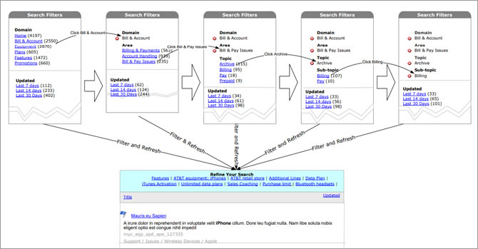
The search function worked poorly. It's hard to find the information for the call center representatives. Each call center representative only had a limit timeframe to answer the questions. Each second counts. If we could create a better search function, we would reduce a lot of time search time which saved the company a lot of money. Time is money is very true for the call centers.
The application supported more than 30 channels and 40 markets so this was a very complex information site. Due to the large scale information data, we needed to rethink the sitemap structure so it would help the search function altogether.
My high-level goals were to:
- Improve Search function
- Re-organize navigation system and sitemap
- Responsive Website
Field Studies
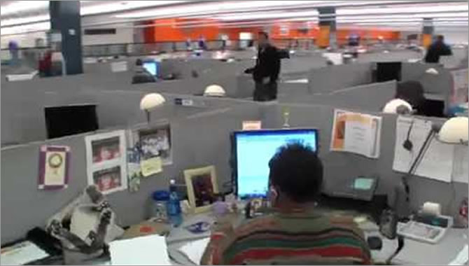
For this project, I went to the call center for 3 days. Each day I listened to the calls with a different agent. While listened to the calls, I learned how they used the application.
End of each day, I interviewed the end-users and asked them about the pain points and what areas to add that could benefit their work.
My high-level goals were to:
- Gather task information – To find out how the end-users did things and why they did them in particular ways
- Understand user’s needs – To discover opportunities for addressing user's needs
- Obtain data for user stories – To understand the users in-depth so I could better describe them for the team.
The findings:
- Confusing and misleading navigation
- Inaccurate search results
- Longer Information loading time
Learnings
It’s difficult to identify gaps in one’s understanding. Early design research can help prevent big mistakes when creating products and services. I had learned a lot just by talking to the end-users. Field studies really helped me to learn about users, their goals, challenges, and activities.
Card Sorting
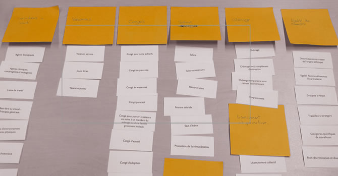
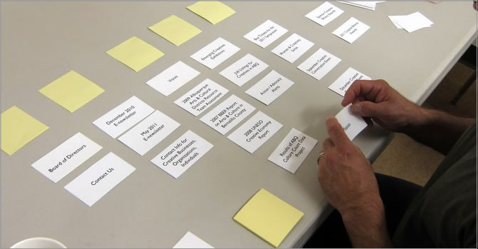
We took all the findings back to the office and worked with Information Architect and Content Strategist to create information structure such as taxonomy, sitemap, navigation, and user flows.
Part of making a site easy to use was organizing information so that people found what they’re looking for. Due to the large information, we spent a lot of time working on taxonomies. We also invited the end-users to do the card sorting exercise with us so they could help us to organize the navigation and sitemap from the end-users' point of view.
We used two types of card sorting
- Open Card Sort: Paper – Participants sort cards into categories that make sense to them, and label each category themselves. We used this with the design teams.
- Closed card sort: Paper – Participants sort cards into categories we give them. We used this with the end-users.
We asked users to group information and features the way it was meaningful to them. This exercise was aimed to understand their mindset, identify labels obtain expected to find them on the website.
Based on these results the website architecture was defined, and so was the flow to learn about the plans and promotions offered.
Learnings
If users can’t find what they want in seconds, by either browsing or searching, they’re unlikely to stick around. As a result, the information site benefits greatly from an intuitive structure and organization.
For most of the projects that I worked with, IA was created from the business structure of the organization, rather than from users’ needs. I was glad that we got users involved in organizing the information on our website. It helped us to improve the labeling, grouping, and organization of information.
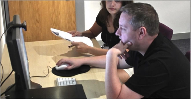
User Testing
When I'm too close to my work, it’s impossible to look at it without bias. What matters to me – might be different from what matters to the end-user. And when I had real users tested the design, we would get a fresh, unbiased perspective.
After we defined the navigation, we created a low fidelity prototype to do some user testing to make sure our grouping met users’ needs. We gathered the feedback and refined our information architecture base on the users' feedback.
Learnings
Getting feedback from the users helped us make research-backed, user-centered design decisions. Armed with user insights, we avoided expensive development errors and proactively address our user’s problems. Early user testing really helped us to refine our solutions.
Solutions
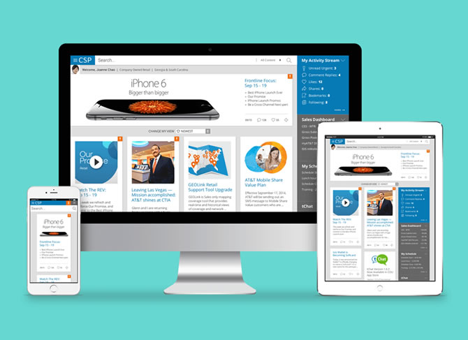
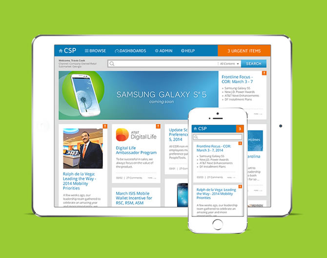
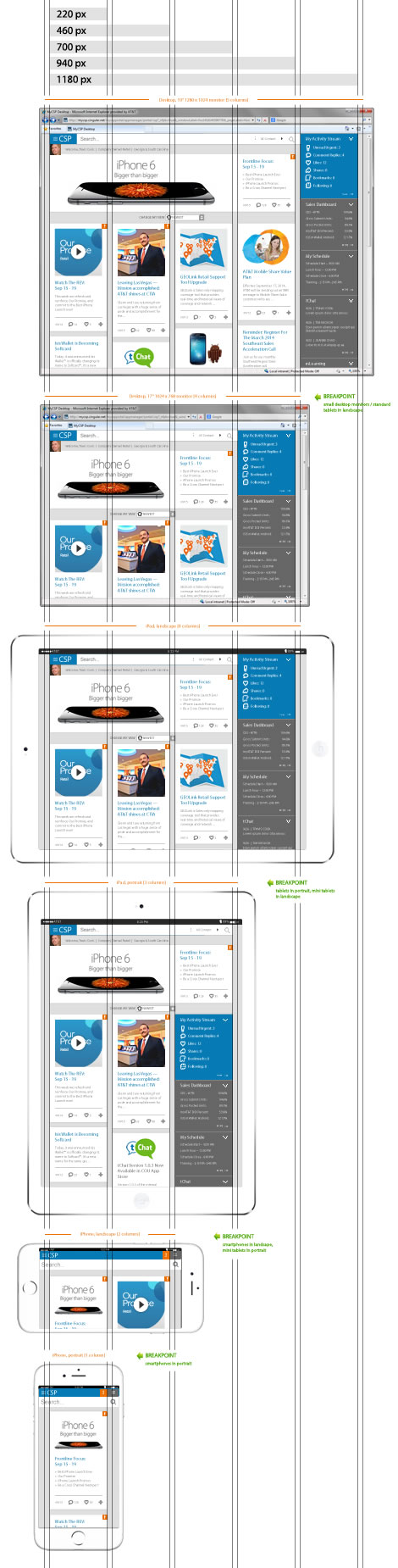
After the sitemap was done, we started to work on the UI design. Besides the search function, one of the main focus points for this redesign was to create a responsive design so it could meet the desktop (call centers) and tablet (retail stores) users' needs.
Responsive Break Points
- 1180px (5 columns)- Desktop: 19" 1280x1024 monitor
- 940px (4 columns)- Small Desktop: 17" 1024x768 monitor/ Standard Tablets in landscape
- 700px (3 Columns)- Standard Tablets in portrait/ Mini tablets in landscape
- 460px (2 Columns)- Smart Phones in landscape/ Mini tablets in portrait
- 220px (1 column)- Smart Phones in portrait
The Benefits of Using a Grid
- Clarity/Order - Grids bring order to a layout making it easier for users to find and navigate through inform
- Efficiency - Grids allow to quickly add elements to a layout
- Economy - Grids make it easier for the team to work and collaborate on the design
- Consistency - Grids lead to consistency in the layout of pages
Learnings
Before the redesign, we had both desktop and mobile versions which took up more time to develop and maintain. When we've got two distinct versions of the website, we needed to keep track of two sets of website analytics so we know where the users were coming from and how they interact with the content. With responsive design, the website stats were greatly simplified as we were staying on top of a single set of data. It saved us a lot of time duplicating the contents.
That was just the beginning of this redesign project. We always looked for better features and keep the site alive with news and content relevant to each channel and market.
What have I learned?
- Always test with the right target audience
In most UX projects this goes without saying, but here it gained even more importance. Having limited knowledge about the culture and the market, our end-users gave us crucial insights that we wouldn’t have gotten otherwise.
- Keep flexible in collaboration
We all have our preferred working and communicating methods, but if the team wanted to introduce something else, tried not to say no right away. I started using it, tested it, checked to see if it worked. We never know, we might end up with a method we’ll love later on.
Achievements
- The leadership reported the savings of $65M
- This application won "The Top 10 Best-Designed Intranets" award form Nielsen Norman Group
Executive Summary from Nielsen Norman Group:
"Helping frontline employees provide quick answers to customers, the knowledge management portal streamlines essential communications focused on making every second count. Clean design, smart details, video messages, and mobile access all contribute to educating and informing employees in a remarkably efficient way."