Money Movement
- Native Mobile App
Payments and transfers within our digital banking experience were built around internal money-movement rails, not around customer needs. Instead of simply choosing who to pay and how much, customers were forced to navigate rail-specific menus and terminology that didn't match their mental models.
This created a fragmented, confusing experience that led to:
- Too many menu options, causing cognitive overload
- ~25% drop-off during payment and transfer flows
- Over 500K call-center inquiries related to payments
- Customers abandoning digital channels in favor of branches
- Only 28% adoption of digital bill payments
The result was a costly, inefficient ecosystem with poor customer satisfaction.
Business Impact:
- High operational costs (branch visits + call center volume)
- Migration to third-party or merchant payment platforms
- Lower Net Promoter Score (NPS) and reduced trust in our digital capabilities
Objective:
Our goal was to design a simplified, safe, and secure money-movement experience that:
- Allows customers to complete all payment and transfer tasks from one unified place
- Removes rail-specific complexity and focuses on customer intent
- Recommends the best payment option automatically
- Integrates all money-movement rails into a single, intelligent platform
- Reduces friction, increases digital adoption, and lowers operational costs
My Role:
UX / UI: Competitive Analysis | User Flows | Sitemap | Low - High-Fidelity Wireframes | Style Guide | Prototypes | Mockups | A/B Testing | Usability Testing Analysis | QA/UAT
Team:
Agile Methodology | Stakeholders | Product Owners | Business Analyst | Content Strategist | UX/UI Designers | UX Researcher | Copy | Developers | Scrum Master | Accessibility (ADA)
The Challenge
The core challenge was to increase the success rate of online money transfers and bill payments while reducing the heavy reliance on call centers and branch visits. Customers were struggling to complete basic money-movement tasks, and the experience wasn't aligned with how people naturally think about sending money.
To address this, I needed to shift the experience from a rail-driven system to a customer-intent-driven platform— one that feels simple, trustworthy, and intuitive.
Project Goals:
My high-level goals centered on creating a platform that removes friction, builds confidence, and intelligently supports customer decisions:
- Deliver a seamless, intuitive experience by eliminating digital pain points and reducing unnecessary steps
- Introduce intelligent routing and guidance— including dynamic pricing, offer management, and smart prompts— to help customers choose the fastest and most cost-effective method
- Design for emotional reassurance, acknowledging that sending money is a moment tied to trust, security, and personal significance
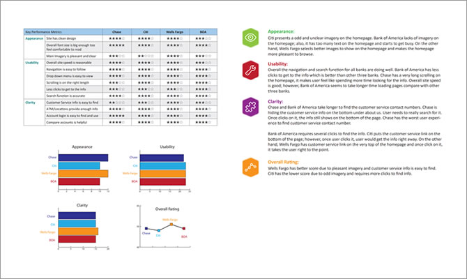
Competitive Analysis
At the start of the project, we conducted a competitive analysis to understand how leading banks structure their money-movement experiences. We evaluated the "send money to people" flows from Chase, Wells Fargo, and Bank of America, comparing them step-by-step to identify patterns, strengths, and gaps.
What stood out immediately was the clarity of language used by competitors. Their flows relied on simple, customer-friendly terminology, making it easier for users to understand what action to take next. This contrasted sharply with our rail-driven approach, which introduced unnecessary complexity and confusion.
Key Learnings
- Most mobile banking experiences are organized around individual payment types, not around simplifying choices for the customer
- This creates fragmented journeys and forces users to understand internal systems they shouldn't need to think about
- The lack of a unified, intent-based approach presents a significant opportunity to differentiate
In short, the market is full of feature-rich apps, but very few offer a truly simplified, customer-centric money-movement experience. This gap became a clear opportunity for us to innovate.
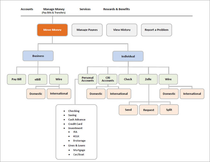
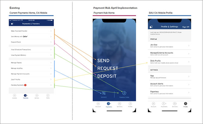
Site Map
Creating the site map helped me organize both the user flows and the overall information structure. When collaborating with a team, I found that combining user flows with the site map significantly reduced inconsistencies across documentation. Like every part of the design process, both the user flows and the site map evolved continuously as we learned more about user needs.
Learnings
I learned not to treat the site map as a static deliverable. Its purpose is to stay adaptable—expanding when new patterns emerge and contracting when ideas prove unnecessary. Keeping it flexible made it easier for the team to stay aligned and make informed decisions.
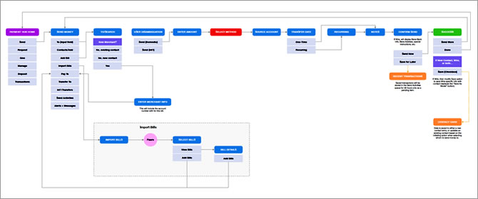
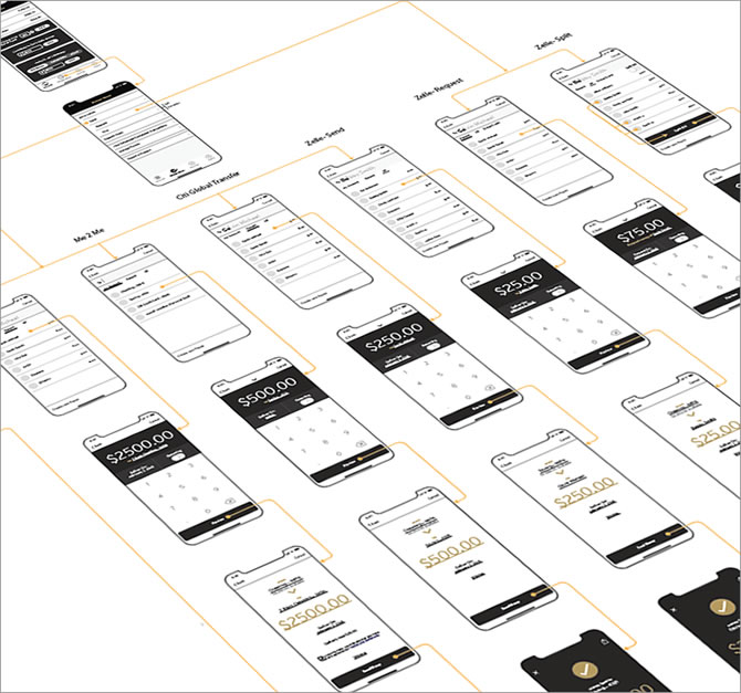
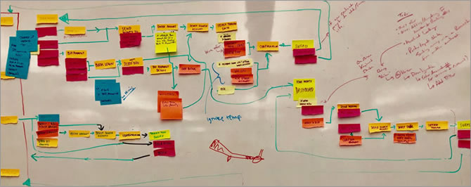
User Flows
To understand how customers move through the experience, I created detailed user flow diagrams that mapped every step required to achieve the core goal:
"As a banking customer, I want to send or transfer money to anyone, anywhere, through my mobile app."
While mapping these flows, I had to balance two perspectives:
- The customer's intent, which varies depending on the situation
- The business goals, which include efficiency, compliance, and operational cost reduction
Keeping both in mind helped ensure that the flows were not only intuitive but also aligned with organizational priorities.
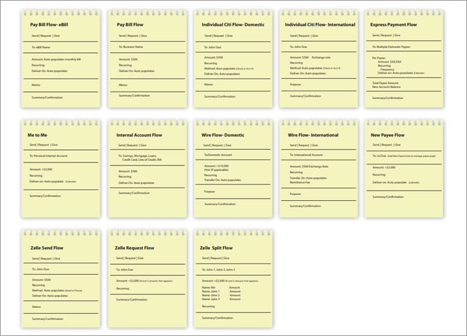
Learnings
During exploration, we tested two structural approaches:
- "One Page" — extremely lean, but lacked clarity and guidance
- "One Action Per Page" — highly structured, but felt slow and overwhelming
Neither approach fully solved the problem. We needed a model that combined clarity with efficiency.
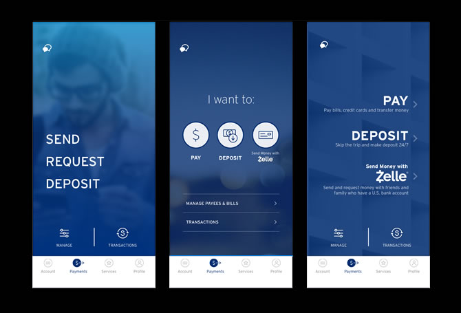
This led us to challenge existing best practices and rethink the experience from the ground up. Through multiple brainstorming sessions, we arrived at a breakthrough concept:
"One Module Fits All"
A flexible, unified module that adapts to different money-movement scenarios— allowing us to simplify the experience without sacrificing functionality. This became the foundation for a more intuitive, scalable, and future-ready design.
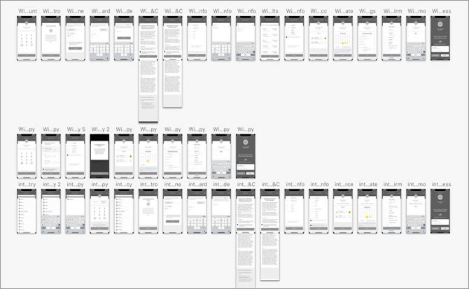
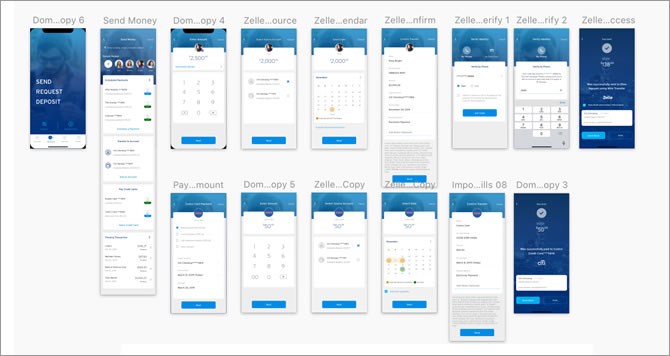
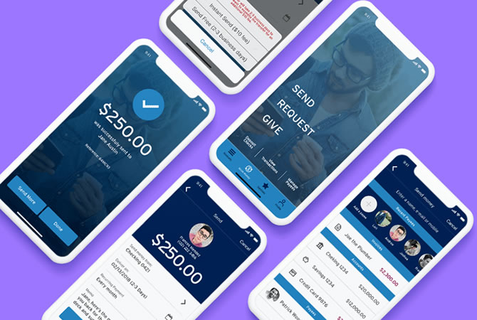
Wireframe
Throughout the design process, I created wireframes ranging from quick sketches to high-fidelity layouts. Each iteration incorporated feedback from designers, product partners, and business stakeholders to ensure alignment across teams.
A key principle guiding my decisions was to stay consistent with the existing app ecosystem while pushing the visual language forward. As Picasso said, "Learn the rules like a pro, so you can break them like an artist." I applied this mindset to modernize the experience-introducing a fresher, more youthful look-while still respecting the brand's established patterns and constraints.
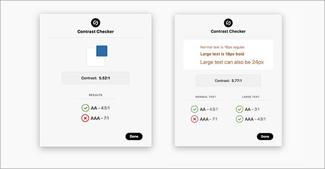
Accessibility
Accessibility was a non-negotiable requirement for a financial product. I validated color contrast using the Stark plugin in Sketch to ensure compliance with WCAG 2.0 AA standards:
- Minimum 4.5:1 contrast ratio for normal text
- Minimum 3:1 for large text
- Minimum 3:1 for UI components and graphical elements
This ensured that the interface remained usable and trustworthy for all customers, including those with visual impairments.
Design System & Collaboration
To maintain consistency across the design team, I created a Sketch library and style guide. This system standardized components, typography, spacing, and interaction patterns-allowing designers to build new flows quickly and ensuring a cohesive experience across the app.
Learnings
Given the tight timeline, I wished we had more space to explore low-fidelity wireframes before moving into high-fidelity designs. Lo-fi prototypes are incredibly valuable for aligning on functionality early and preventing teams from getting distracted by visual details too soon. Even with time constraints, this reinforced the importance of starting lean to drive clearer design conversations.
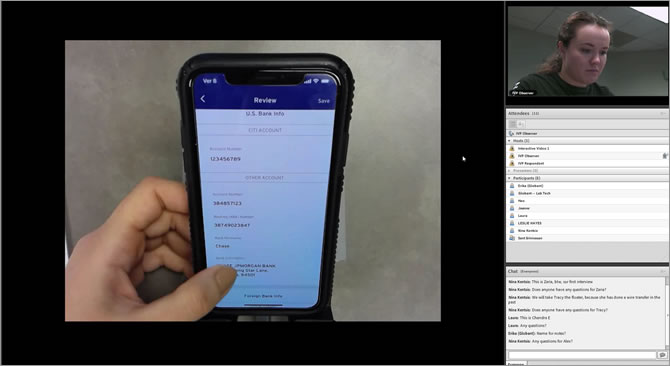
Usability Test Learnings
Our UX researcher led a series of A/B tests and moderated usability sessions, supported by a third-party research partner. We began with an interactive Flinto prototype to validate early assumptions and progressively refined the experience as we moved toward higher-fidelity solutions.
All designers had access to session recordings, which helped the entire team build empathy and understand user motivations, frustrations, and expectations firsthand.
We conducted multiple rounds of testing, each with at least five participants from our target user group. This iterative approach allowed us to quickly identify friction points, validate improvements, and ensure the final experience aligned with real user behavior.
Key Solutions & Insights
Ownership
Users consistently responded positively to elements that made the experience feel personal. They appreciated when the app reflected their preferences and gave them a sense of control over their money-movement tasks.
Learnability
We shifted from a single, dense onboarding screen to a progressive onboarding model. This reduced cognitive load and helped users understand features at the moment they needed them, rather than all at once.
UI Improvements
Preference testing revealed that certain graphical elements were visually overwhelming. We created rapid UI iterations— adjusting image sizes, simplifying visuals, and refining layout hierarchy— to improve clarity and reduce distraction.
What I learned
- Research is non-negotiable
- Keep the user's voice in the room
- Communication is critical to execution
I couldn't have designed a product users truly value without involving the people who would actually use it. User surveys and interviews surfaced unexpected behaviors and needs, allowing us to shape the product around real-world use rather than assumptions.
Running usability tests and gathering feedback at multiple stages helped uncover pain points early— before they became expensive to fix. Continuous validation made the experience more intuitive and reduced friction across key flows.
This was my first time collaborating with both iOS and Android development teams in parallel. I learned that designer-developer checkpoints shouldn't be a one-time event— they need to happen early and often. Starting conversations in the early design phase, documenting decisions clearly, and iterating together turned our discussions into a living checklist that kept everyone aligned and reduced surprises during implementation.